1964 The publication in 1964 of his novel Ik Jan Cremer (I Jan Cremer) brought the author overnight fame and notoriety. But even when the first extract appeared in the literary review Gard Sivik in 1962, some readers, such as Willem Frederik Hermans and Johan Polak, the erudite publisher of classical literature, had realized there was some- thing special about Cremer.
1988 In a lengthy article in Vrij Nederland to coincide with Cremer's retrospective exhibition at the Rijksmuseum (National Museum) in Twenthe, Rudie Kagie quotes a number of early collectors of Cremer's visual art. Johan Polak: 'I first met Jan in the early sixties when he had an exhibition in a gallery on the Willemsparkweg. (...) I remember saying to the publisher Lubberhuizen (after reading extracts from Gard Sivik): Mark my words, that Jan Cremer is a major talent. I already had a feeling De Bezige Bij would publish the book.' Kagie writes that Polak, owner of an extensive art collection which included three gouaches by Cremer, thought that Cremer could have achieved worldwide fame as a painter if he had limited himself to that artistic medium. The fact that the quality of his paintings declined during the sixties was hardly surprising: the best-selling author was engrossed in so many other things. 'It's a familiar syndrome,' Polak is quoted as saying. 'Creative juices run dry at some point. Goethe, Boutens and Leopold, for example, were unique in their ability to maintain consistent quality in their work. Peaks and troughs usually characterize creative development. So I think it's very possible that Jan Cremer could come up with entirely new work once he's passed his fifties.'
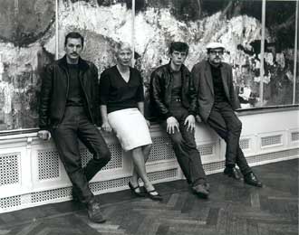 1998 Sadly, Johan Polak would not live to attend the private view of Jan Cremer's Recent Graphic Art, Terra Toscana, held in February this year in art gallery Clement in Amsterdam. As if Cremer the author would have made lavish use of terze rime and quatrains, Cremer the etcher reveals sharply pared-down and subdued landscapes which ad- here to the rules of perspective, a classicism acquired over the years which is in sharp contrast to the turbulent explosions of shape and colour with which he burst onto the art scene as The Beast, The Barbarian. Jan Cremer's life is less interwoven with his art than his art is interwoven with his life, which begins as a matter of survival.
1942 His father dies in 1942. Cremer is two years old. At age five, he is taken away from his beloved mother. As a war orphan, he is moved from one home and foster family to the next. He keeps running away. Unmanageable. His first fugue into foreign parts takes Jan Cremer, aged barely fourteen, to Paris, the City of Light. Two panels, painted on hardboard, still survive from his 1954 expedition. In retrospect, they seem symbolic because in his early years, art, whether writing or painting, was literally his life raft. Accounts based on his drawings and paintings of how closely inter- woven his hectic life was with his art (and the hiatuses in it) have been given elsewhere on numerous occasions. His artistic debut could hardly be described as evolutionary in that it unfolded in jerks and starts and consisted of modelling his work on samples from art books by Klee and Miro viewed from a fourteen/fifteen year old's perspective, and brief and sporadic stints at various Academies. Although not academically inclined, Cremer is a student with an insatiable appetite for learning as well as an irrepressible rogue who soon went too far. He committed his exploits to paper better than anyone else. But he has respectful mem- ories of the surrogate father figures in his life - teachers, guardians and lecturers - despite the fact that he sometimes used them as examples of toffee-nosed public spiritedness in his picaresque prose. They, for their part, watched with interest his early forays into the visual arts and, as in the case of George Lampe's 1961 review, scrutinised the creative impulse behind the provocative façade of 'De Barbaar' (The Barbarian). Cremer's exceptional talent for graphic art, even at the age of fifteen, was immediately apparent from his first linocut, vrouw met zwaard (1955) (Woman with Sword). It was clearly not an image that welled up spontaneously in the student's mind; it looks like a copy or an almost typographic transposition (made by cutting up pieces of paper) of the kind of expressionist image that Scherer and Kirchner construed from primitive art and gothic sculptures. The geometric patterns in the head, hands and feet make the body itself seem all the more animated. The knife in the linocut gives a sense of logic to the lacerated body and is a reference to the medium of carving which was certainly not spontan- eous.
1955 This is the year when Cremer discovers the work of Karel Appel, when 'a new world opens to him' when he sees Appel working on the famous E55 (Expo) murals display. In Rotterdam Cremer is engaged to hand him paintbrushes while he works.
Appel's influence expresses itself in Cremer's paintings and graphic art in forms such as birds and cats. Red soon becomes the dominant colour in his canvases. In 1957 Cremer works briefly in a Paris slaughterhouse which inspires in him the concept of Barbarism. His large 1958 canvas Barbaar (Barbarian) appears to be monochrome red but has a plaster base: a warrior on horseback. Cremer discovered the art of working in relief with Bram Bogart in Paris. With barbarism, Cremer was in his element as a painter but also as a stuntman. But the slow process involved in graphic art was less conducive to these explosions and the lithograph natasha (1958), which is much freer but also much more ponderous in form than his first print, once again conveys the sense of a portrayal of a wooden sculpture rather than a live model. The text is that of romantic Bohemianism, as is the case in vuurvogel (1958) (Firebird). This print still has echoes of the Cobra movement, with its lyricism of sea, beaches and mythical animals which were already a forte of Carl-Henning Pedersen's work in the Forties. Wim Beeren bought the print in 1958 for the Haags Gemeentemuseum (The Hague Municipal Museum) and wrote: 'Although Vuurvogel (Firebird), with its intermingling of words and images, had a post-Cobra emphasis, it also had something authentic about it, something which suggested a growing sense of freedom in the visual arts.' Prints are produced sporadically, sometimes only one copy survives. The subject matter varies and limp along behind the rapid eruptions on canvas. Not until 1959 do graphic art and drawing converge - as, for example, in compositie met goud (Composition with gold), with its splashes of colour, dripping ink splodges and swiftly flattened areas: Cremer has broken free of the slow, hesitant process of drawing on stone. In the meantime, he has come into contact with professional printers such as Jean Pons in Paris and Piet Clement in Amsterdam. In 1967 he will also work with the Danish 'Cobra-printer', Peter Bramsen, in Paris, but in the main, his graphic art will be produced in the (Amster damse steendrukkerij) lithographic printing works of Piet Clement.
 1963 During his first stay in Ibiza in 1961 Cremer briefly hits the jackpot with his exhibition at art gallery Vedra. But money is there to be spent and even though his second exhibition is a sell-out, the debts have mounted up. When he has no paint, he even works with coloured tissue paper which he glues on: meticulous and calculating work in which he still manages to feign spontaneity. How did Cremer's barbar-ism relate to the obvious models used in the abstract expressionism of Appel, De Kooning, Pollock or Kline? All their striking work came about as a result of personal development, or chance, and pursuing a classical training. The only aspects of their work that Cremer draws on are those which break with art history, not those which bind them to it. His painting at once occupied the gap between style and symbolism. After the publication of his Inevitable Best-Seller, Cremer leaves Holland for London and finally New York where he is welcomed by Frank O'Hara, a poet who also works as a curator in the Museum of Modern Art. Cremer met Frank O'Hara in 1963 when O'Hara was in Amsterdam mounting a retrospective exhibition in Amsterdam's Museum of Modern Art of the works of Franz Kline who had recently died. Cremer spent several days with him, and in the Haagse Post, quoted O'Hara, as if he were hearing his own work described: 'Kline's approach to the black-and-white technique is entirely new. His shapes are bold and simple, his gestures abrupt and passionate; all the subtleties he had so zealously learned from earlier masters have been cast aside.' (Kline abandoned figuration in 1949 after viewing fragments of his sketches on a Bell Opticon enlarger, and gave up using fine paintbrushes in favour of larger ones). Frank O'Hara selected a series of gouaches from Cremer's studio which he would write ten poems for. The collection, which included ten screen prints of Cremer's 1963 originals, was not published until 1978. O'Hara apparently wrote his poems on separate occasions, during lunch breaks - Lunch poems. The verses he sends to Cremer referred obliquely to the painter's subject matter: targets, the British call girl Christine Keeler crushed beneath a Union Jack wheel, Kennedy's coffin, a tornado. In O'Hara's case: war planes, sharpshooters, bisexual sex and death as a transvestite, reminiscent of Pasolini who would be battered to death much later:
if anyone sees through my merchant drag/I'll go out tomorrow morning/with the garbage/It won't be an explosion/just a package.
Frank O'Hara meets his end in an absurd fashion in 1966: on car-free Fire Island, he is run over by the only car on the island, the rescue team's Land Rover. Shortly before his death, he penned a long 'conversation with the sun on Fire Island' between waking and falling asleep, which ends with the words:
'- and I may leave a tiny poem in that brain of yours as my farewell' 'Sun don't go!' I was awake at last 'No, go I must, they're calling me.' 'Who are they?' Rising he said 'Some day you'll know. They're calling to you too.' Darkly he rose, and then I slept. The theme of people dying was not central to Cremer's outlook, al- though he did show a preoccupation with animals dying. His barbaric scenes of war savaged nature and the canvas itself. But then again, in Ik Jan Cremer II (p. 339), he writes: 'A shock wave has hit the world. Kennedy is dead. (...) Now that Kennedy has died, the Foundations of the New Pop World have been washed away. The Eagle has taken to the air in fright amidst a flutter of wings. Until he descends again and takes hold of America. America, I'm coming. As soon as I can.' And in Made in U.S.A., a tongue-in-cheek reportage about pulp magazines, the sex industry and the hypocrisy surrounding it, one chapter (p. 150) suddenly sounds an incongruous note: Cremer's devastation at the death of his friend Gustave Asselbergs and the passing away of Jayne Mansfield and Frank O'Hara. Eleven or twelve years after O'Hara's death, Cremer produces a series of screen prints based on designs from New York: dutch landscapes (1973) and dutch masters (1965). Whilst still living in New York, it was only at Peter Bramsen's in Paris that he produced two prints for the famous 'Print 190' - named after the edition two Hot Dogs in which the phallic shape tapers to nipples (he also designed billboards, sofas and a zeppelin drawing on this same inspiration). dutch masters is a gentle poke at Larry Rivers, who copied Rembrandt's Drapers' Guild in the style of an advertisement based on it, adding a cigar box in a palette of grey and brown which refers to both. Cremer parodied Rivers' parody using an orange-red colour scheme. His collaborative work with O'Hara is published as the new york-amsterdam set or the end of the far west (1978) and was evidence that the New York age had already dawned in Amsterdam. The wild scratching and extensive use of fused shapes gives way, after the stylised thundercloud (1963), to compositions with red-and-white bands of colour going in various directions. The barbaric, phallic ram's head (the punch of a fist, the tank-cannon) ends as the wheel of death, suffocation. O'Hara was forty years old when he died. When Cremer arrived in New York, he had welcomed him and put him up in the Chelsea Hotel where his friend's Larry Rivers studio became available (O'Hara had posed as a model for Rivers in the Fifties). Cremer and Rivers knew one another from their respective periods in Paris. Many European artists including Arman, Tinguely, Niki de St. Phalle, Spoerri, Filliou were guests at the Chelsea. In addition to Willem de Kooning, Cremer was in frequent contact with Tom Wesselmann and Allan d'Arcangelo, whose works were characterised by an extremely scaled-down colour palette in imitation of Rivers, whose work marked the transition from expressive style and clichéd subject matter. Cremer, too, was now moving in that direction. His work with O'Hara takes Cremer the painter into new territory; to complete the second part of his novel, Cremer has to delve back into the past - into his crazy time in Ibiza. During that period, his work straddles the past and the present and, in the words of Wim Beeren, he paints about Holland in a 'narrative' way evocative of clich d picture postcards from the Land of Tulips 'as only an expatriate could do'.
1965 In 1965, his first tulip fields appear in which the shape of the flowers roughly resembles the shape of a heart. The heart-tulips billow out towards a horizon truncated by a blue, mostly empty, sky. The blue, which had already framed many compositions in the new york-amsterdam set, would recur in the form of a solid or modulated 'band' at the top of many of his later canvases and prints. Many of the New York canvases are painted over, negatives of photographic documentation are lost. Cremer quit the city for a large, white wooden house on Cape Cod where he completed Made in U.S.A. He then moves to London, and from there takes frequent trips to Mongolia, Lapland, Canada, Indonesia etc. He produces a few prints at Peter Bramsen's (1971): empty expanses of land and water threatened by approaching storms and idyllically embraced by a delicate rainbow. Using a technique he developed with Asger Jorn, Bramsen turns the rainbow into an iris-print where the colours gradually dissolve.
1973 In 1973, having been recommended by author Walter Van den Broeck and graphic artist Jef Geys, Jan Cremer receives an invitation from Flemish Minister of Culture Van Mechelen to come and work in the recently established Frans Masereel Centre in Kasterlee. The round building with its antique printing presses is surrounded by tent-shaped bungalows for the artists. Cremer moves into one and gets down to work right away. In an ironic allusion to Paulus Potter's bulls, he plops down heavy cows, using the litho stone to create mirror images. Then he places a red-and-white barrier next to the cow: to symbolise a frontier. Cremer was born near the Dutch-German border and as a traveller was obsessed with the concept. Frontier, taboo, ban. At the top of his picture, he puts a broad band of blue sky. In 1974, Cremer receives the frans masereel award for his print at the Rijkscentrum. In 1976 Roger Raveel exhibits his series Genesis in the Centre accompanied by poems by Hugo Claus and lavishes on Cremer's graphic works already printed in Piet Clement's lithography printing works - a visually complex variation on the 1973 works of copulating cows. This sophisticated composition with its brazen black-and-white patches superimposed over the base colours is nicely in keeping with the melancholy print sneeuw (Snow) from 1975 - an indistinct group of cows in a pasture overprinted with coarse snowflakes in the pointillist style.
Dutch landscapes and hollands prentenboek (Dutch Picture Book) are characterized by an interaction between visual dissonance and dissymmetry within a tight, harmonious composition under a blue band of sky. A second part of the Hollands Prentenboek (Dutch Picture Book) is perhaps more in line with the expectations of Cremer's readers: provocatively outstretched naked women. Their faces are very stylised, their bodies in harmony with the undulating landscape, the sheaves of corn, the colours of the ploughed earth. Cremer writes in his work notebook how he was inspired by Tarkovsky's film about the master icon painter Andrej Rubljow. The affinity with Malevich's peasant paintings is also strikingly evident. The combination of hard and soft-edged shapes, the geometric patterns and alternating freely-drawn crayon lines, the contrast between the landscape and the animals frozen in motion - everything fits with, or, like the mating animals, into, everything else.
TULIPS In 1979, the first independent Tulpen (Tulips) appear - Cremer's theme of 1991 and his trademark from then on. First he is commissioned to produce zestien zelfportretten (1980) (Sixteen Self-portraits), a series of screen prints whose theme consists of the famous photograph of the young, nonchalant adventurer on his Harley-Davidson. Other works are based on his large paintings, such as blue horse (1985), the horse's head which bleeds black blood, the taunted animal that can no longer rear up.
Meanwhile, Cremer has retreated to write the 1500-odd pages of his epos De Hunnen. After its publication in 1983, his wanderlust resurfaces and he produces canvases, and in their wake, lithographs and screen prints, inspired by far-away landscapes. The barbarian seems to crop up again in his brush technique, sometimes clearly alluding to Willem de Kooning's robust wielding of the brush and knife, but working in patterns: the Chinese landscapes are triangular like the yurts from Kirgizia, the Swiss mist alternates with snow and the Provence soil breathes in the sunshine given the changing psyche of the painter, the recent views of Tuscany, with their cyprus trees standing neatly in line, seem indeed 'far away'.
In 1991, Cremer again seizes on the tulip and the heart as leitmotifs, touchstones, suggestions. In his etchings, he dryly dissects basic shapes and colours (tulip germania, 1996), in his screen prints, he plays with variations ranging from the dripping paint of wilde tulpen (Wild Tulips) (1991) to the monotype genre (nine tulips yellow field, 1996). The Tulips acquire a 'national' dimension because of the underlying newspapers from different countries that he uses (europa series, 1995). Other Tulips are personalised - the actress Fanny Ardant gets, amongst other things, the movie section of a Parisian paper. And the Sahara is sprinkled with a Röntgen-like Tulip-Heart (1998).
Tulips and hearts, arranged in horizontal lines, superimposed in perspective or stamped en masse, drawn in diamond shapes, scratched out, stroked, tortured, exalted... Tulips and hearts as ball masks, mounts of Venus, in national colours or as far-away landscapes..
It's a long time since Cremer presented his first Dutch-American works to Frank O'Hara in his studio at the Chelsea Hotel in New York in 1965 when the motif made its first tentative appearance. It was not until seven years ago that it really came into its own in the workshop of Piet Clement, with whom he explored the possibilities of the genre, from the simple eighteenth-century stone-by-stone printing process to the soph-isticated workmanship of today. It is not Cremer's cow, but his tulip which has come to stand alongside the bull that symbolises Potter.
